 Does your blog look professional?
Making your blog look professional is going to attract more readers, and it will get them to stay on your blog longer.
It’s just human nature.
Improve the experience your users have, and they will enjoy your blog more.
Since people prefer pleasure to pain, your blog will benefit greatly by making it more visually appealing.
It’s like a book.
Special: Join Donna’s Free VIP Blogging Club – Free Now… Free Forever
Do you really want to just read tiny, tightly spaced black text on yellowing pages?
Or do you prefer larger fonts with lots of space and a clean white background?
If you make the presentation of your blog as user friendly as possible, it only stands to reason that more people will spend more time on your blog.
And that increases your page rankings, click-throughs on your links, subscribers to your email list and more.
First Impressions
The visual design of your blog’s website is an important aspect of your business.
When people first see your website, they will judge it.
They’ll think it’s appealing and professional, or awkward and confusing.
You can control the perception of your blog by giving it the most inviting, clear and professional look possible.
I suggest you use this article like a checklist of things to assess and perfect on your blog, whether it’s a new blog or an existing one.
So now, let’s talk about the things you can do to take control of the first impression your website makes on people.
Focus on how you can make your blog look more professional.
Create a professional website design
1- Blogging Themes
The first thing you need to have is a good blogging theme.
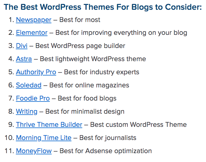
 You might want to consider some of the above WordPress blog themes on CrazyEgg.
Your entire blog sits on a website.
So your website design will have a major impact on your readers.
There are free website designs, and there are premium designs… ones you have to pay for.
I always suggest using a paid theme.
Free software is not usually updated and improved like paid ones are.
If you’re trying to save a few dollars on the budget, your theme is not the place to be stingy.
The whole look of your blog depends on your theme.
So get a good and dependable one, and give your blog an inviting and professional look.
2- Header
Your header should be something that coordinates with your entire theme.
And it should make people want to stay on your blog.
If you’re using a picture of yourself for a personal branding effect, make sure it’s a high quality photo, not just something you snapped off on your phone.
But if you’re using a different type of image, just be sure that it looks really professional.
If you’re using a web designer to set things up for you, this should all be done for you.
But if you’re trying to do it yourself (not recommended unless you’re an accomplished graphic designer), then make sure it’s done well.
You could even consider getting a freelancer to create a header for you.
3- Title and subtitle
Your blog’s title and subtitle is one of the most important things you need to decide on when setting up your website.
For the best SEO (search engine optimization) impact, your blog title should be descriptive of what you do.
If your blog is about photography and photo equipment, you don’t want to call it something like “Marilyn’s Place.”
The SEO bots will never pick that title as being descriptive of what your blog is about.
So if someone is searching for “photo equipment” on Google, they’re not likely to be finding “Marilyn’s Place” in the search results.
Think of your title and subtitle as the main keywords for your blog.
That way, when people land on your blog, they’ll know they’re in the right place.
4- Layout
Decide on the most professional kind of layout for your readers.
Do you think they want to see a sidebar with ads and opt-in boxes?
Special: Join Donna’s Free VIP Blogging Club – Free Now… Free Forever
If so, you probably want to choose a two column layout.
Or would it be better to have them see a single column that spreads the entire width of the page?
Do you want them to find a scrolling list of your blog posts?
Or would it be better to have a magazine style that shows articles side by side, top to bottom?
These are just some of the things you need to think about when deciding what your website’s layout should be.
5- White space
There’s no doubt that your readers will feel overwhelmed if your blog has lots of text crammed into tiny spaces.
They need to see a lot of white space around all the elements you’ll have on your blog.
That’s just far less intimidating.
It makes your readers feel like they can easily get through the material you have on your blog, without having to wade through heavy, burdensome material.
6- Structure
The structure of your blog involves the kinds of things you want people to see.
I’m talking about things like static pages.
You create these for the benefit of your readers.
One of the most important pages is your “About Me” page.
Then there’s your “Contact” page where people can get in touch with you.
And, of course, you have to have the standard legal pages, usually at the bottom of your web pages.
Make sure these pages, and any others you might want are prominently displayed so people will feel welcomed and engaged.
It makes you seem real to them, instead of like some distant, nameless entity.
And they’ll think of your blog as a conversation instead of an encyclopedia of information.
7- Social media buttons
Your blog should also have social media buttons to create a sense of community.
You would typically put these on a sidebar widget so people can find you on Twitter, Facebook, Pinterest, Instagram or anywhere that you want to redirect them.
The idea, here, is that you will look more trustworthy if you have a social media presence.
And even if people don’t click on your social media buttons, they will get an immediate sense of your authenticity just by seeing them prominently displayed on your website.
8- Opt-in box
Another sidebar widget you should take advantage of is the opt-in box.
Give people an opportunity to sign up for your email list right from your sidebar.
That, again, makes your blog look more professional.
Anyone who has an email list becomes more credible than bloggers who don’t.
9- Logo
A logo always makes a blog look more professional.
This is especially true of blogs that represent a product or service.
It’s particularly important for an e-commerce site.
If you think this seems right for your blog, you can make a logo yourself using free software or services.
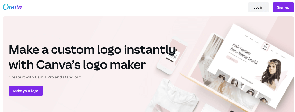
 You might want to try Canva’s free logo maker.
Or you can hire someone very cheaply on a site like Fiverr.
Then work your logo into your header, sidebar, landing pages, or anywhere else that makes your blog look professional.
10- Color
The color scheme of your blog should be consistent throughout.
Decide on a main color to carry through your entire site.
Then use a color palette to find other colors that blend and complement your main color.
Carry that color through your main theme design, and also your logo and anywhere else that you use imagery or color.
11- Domain name
Your domain name is important, too.
A good domain name goes a long way toward making your blog look professional.
So choose something descriptive, and include your main keyword or keyword phrase in it.
Again, this is particularly key for professional, commercial and ecommerce blogs and websites.
But it’s a real good idea to think about this when setting up any blog.
12- Permalink
Your permalink setup is also important for the visual appearance of your blog.
It’s another big reason for having your own privately hosted blog as opposed to blogging on a free site like Blogger or any of the others.
Special: Join Donna’s Free VIP Blogging Club – Free Now… Free Forever
When you have a privately hosted site, your permalink, which is the URL address for your blog posts, will show “your blog’s name dot com” or “dot net” or whatever other extension you have.
With a free site like Blogger, your URL will be “your blog’s name dot blogspot dot com.”
This does not look professional.
It makes it look like you’re only casually blogging, and are not even willing to undertake the very minor expense of setting up your own private blog.
13- Favicon
The favicon is the little symbol or icon that appears in your URL, next to your URL address.
It’s a minor thing to create, but again, gives your blog a very professional appearance.
![]() See ShoutMeLoud’s list of 35 free favicon tools.
See ShoutMeLoud’s list of 35 free favicon tools.
14- Navigation
A really important aspect of your blog’s overall feel and appearance, is it’s navigation scheme.
Make sure people can easily see the key things you want them to, and not a whole hodgepodge of images, flashy animation and advertising.
That will only make your blog look confusing and cryptic.
People should readily see things you want them to navigate to.
When you set up your page menus, for instance, make the titles clear and instantly understood.
So, for instance, your homepage may have pages titled “About Me,” “Contact Me,” “Resources,” “Work with Me,” and of course, “Home.”
If you give these pages titles that people don’t understand right away, they probably won’t click on them, and even worse… they’ll think your blog is not very professional.
Don’t name your pages things like “Phil’s Favorites,” or “Amazingly,” or “Learning Tree,” or some other things I’ve seen.
What do those things mean?
Don’t make your blog a guessing game, or cute puzzle.
People just want to see what you have and how to find it.
They want an easy navigation system to follow.
Always think of what your readers want, not what you might think is catchy or cool.
15- Core message
The entire look of your blog should revolve around one main thing… the core message that you want to share with your readers.
Everything you do, from site arrangement, to sidebar widgets, to navigation and all of it… is about giving a clear message to your readers.
What do you want them to know?
In other words, what does your blog stand for?
How will people benefit by following it?
Some people refer to this as a “mission statement.”
I just call it your core message.
It’s the central theme of your blog, so let the design and visual elements underscore it for your visitors.
Make your blog look professional
Is your blog helpful to your readers?
Whatever your niche, you know you have lots of competition, so you have to make your blog something special.
How will people know it’s special, though?
It begins with your site’s design and visual appeal.
How enticing is your blog?
What is the first impression it makes on people.
Is it a lasting one?
Does it all tie in with your central or core message?
The content you develop on your blog may be the most important part of your blog.
But if people aren’t comfortable with the whole presentation, they may never get that far.
I’d like you to leave me a comment below.
What kind of impression does your blog make on visitors to your site?
How do you believe you can best improve that?
What can you do to make your blog look professional?
-Donna
PS: Share this on your favorite social sites, too. I really appreciate it 🙂


Twitter: shabistudio
May 9, 2022 at 4:35 am #
Hi Donna,
Thanks for the tips. I use “You” a bit more than I should in my posts, as in “You are loved” opposed to “I love you.” Will work on it:)
Hey Donna,
In this post, I got so many tips to make a professional blog site. As I am learning blogging step-by-step, this post is helpful for me. Thanks for this amazing post.
Twitter: brpraveen
March 21, 2022 at 11:27 am #
Hi Donna,
Thanks for the wonderful tips.
I was struggling with white space quite recently, and realized its one my plugins that wasnt loading due to some settings from the provider. I just had to get them look at it and got that squared off.
But it did cause quite some concern, and I just hated how my articles appeared especially on a mobile device.
Twitter: ravishingravism
March 19, 2022 at 8:17 pm #
Hi Donna,
One must follow professional approach from day one. Start with business name, logo, favicon, choose right theme, get best hosting, create impressive content and skyrocket.
Thanks for sharing most important points here!
Gaurav Kumar recently posted.. New LinkedIn Future of Skills Tool to Find Top Skills for Any Job
Twitter: vindhyaprocess
March 19, 2022 at 5:27 am #
You have really written and explained it nicely. It is very important to make blogs look professional. Totally agree.
Thanks for helping me through this post. I just started a blog and I am new to this world. Thanks again for guiding me.
Twitter: SMatyjanka
March 17, 2022 at 11:21 pm #
Hi Donna,
The more time I spend online and specifically on blogs the more I notice things like layout and whitespace etc. I think because I look at websites much differently now than I did before I started blogging. Some websites are so crammed with stuff and hard to navigate.
When you are looking for information it doesn’t pay to spend time on these sites searching for things when there are so many alternatives out there. You really need to design your website with the user in mind.
SharlaAnn
SharlaAnn Matyjanka recently posted.. Blog Images-What Are You Missing?